Do custom-created classifications outperform global tree maps like Hansen’s?
In this problem, I created a tree cover map based on the classification of a Landsat 8 scene, and which I then compared to Hansen’s tree cover, which was utilized in the previous independent problem. This was done by creating a set of training points by visually identifying different landcover classes, and using a Random Forest classifier to create the classified image (Figure 1). Then, I created an agreement map that showed where my classifier and Hansen’s classifications aligned.
Figure 1) The classified Landsat 8 image. The classifications are as follows: green indicates forested land, yellow indicates farmland, orange indicates urban, coral is grassland, purple indicates grassland, and blue indicates water.
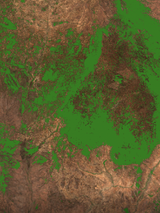
My classification map was effective in identifying and classifying forests. Figures 2a and 2b compare the Landsat image with the same image with the “Forested” classified areas of my map overlaid on top (the red point is how I chose the Landsat tile). It is clear that my classification was able to correctly identify the forested areas. While there are some green forested areas that were left out of the classification, all of the densely packed forests were correctly identified.
Figures 2a and 2b illustrate how my forest classification overlapped with the forests in the Landsat 8 image. Code to produce the classification map here.
The agreement map (Figure 3) below gives deeper insight into the alignment of my classification and Hansen et al.’s, and is classified as followed:
Green (1): Hansen’s classification and my classifications forested areas overlap
Purple (2): my classification did NOT identify forests but Hansen’s did
Orange (3): my classification DID identify forests but Hansen’s did not
Yellow (4): neither my classification nor Hansen’s classification identified forests —there is agreement that there is no forest in that area.
Figure 3) Code to produce this map here.
As you can see there is a lot of agreement in both categories 1 and 4, meaning there was agreement of forest (green), or agreement that there was not forest (yellow). This map, however, illustrates that Hansen defined more areas as tree cover than mine (purple). The agreement map is using ≥30% tree cover per pixel to define “treecover,” while I focused my training points in densely forested areas. These differing forest definitions could be the reason that Hansen classified more area as forested. Zooming into the agreement map (Figure 4, below), it is evident that the Landsat 8 pixels are far larger than Hansen’s classification, thus my classification was only able to classify features on a larger scale which can also contribute to some of the disagreement in the map.
Figure 4.
The chart below (figure 5) also shows that both areas of agreement (1 – there is forest and 2 – no forest) are significantly higher than the areas of disagreement. Thus, while there is disagreement in our classifications, areas of agreement are much higher.
Figure 5) Code to produce the above chart here.
If my map holds truth, the threshold where the Hansen map truly reflects tree cover would have to have full agreement, with values only in the 1 (true positive) and 4 (true negative) classifications. This is not possible for multiple reasons — however, after evaluating agreement from thresholds ranging from 10% – 90%, it appears that the balanced rate (true positive-true negative/2) is highest when the threshold is greater than or equal to 30%, making it the best threshold to evaluate Hansen’s map. As Adjognon, et al. stated, in their paper Satellite-based tree cover mapping for forest conservation in the drylands of Sub Saharan Africa (SSA): Application to Burkina Faso gazetted forests, “the lowest threshold will result in the highest true positive rates and the highest threshold will result in the highest true negative rates,” which is clear from the output charts. For example, if threshold is 90%, it follows that there would be a high rate of true negatives — meaning there are many areas where neither classification had forest, because setting the threshold at 90% entails a lower amount of pixels that are classified as forest. Evaluating the charts for the various thresholds below, it is evident the balance rate is highest when the threshold is 30%, making it the most efficient at showing where Hansen truly reflects tree cover on the ground.
Holding true with Adjognon, et al.’s statement from above, lower thresholds yield highest true positive rates, while higher thresholds yield the highest true negative rates. In comparing the charts, the highest balance rate is at a threshold of greater than or equal to 30% (chart in top right corner). Code to produce the above charts here.
Sources:
Adjognon, et al. “Satellite-based tree cover mapping for forest conservation in the drylands of Sub Saharan Africa (SSA): Application to Burkina Faso gazetted forests.” Development Engineering, vol. 4, 2019, pp. 1-11.


